
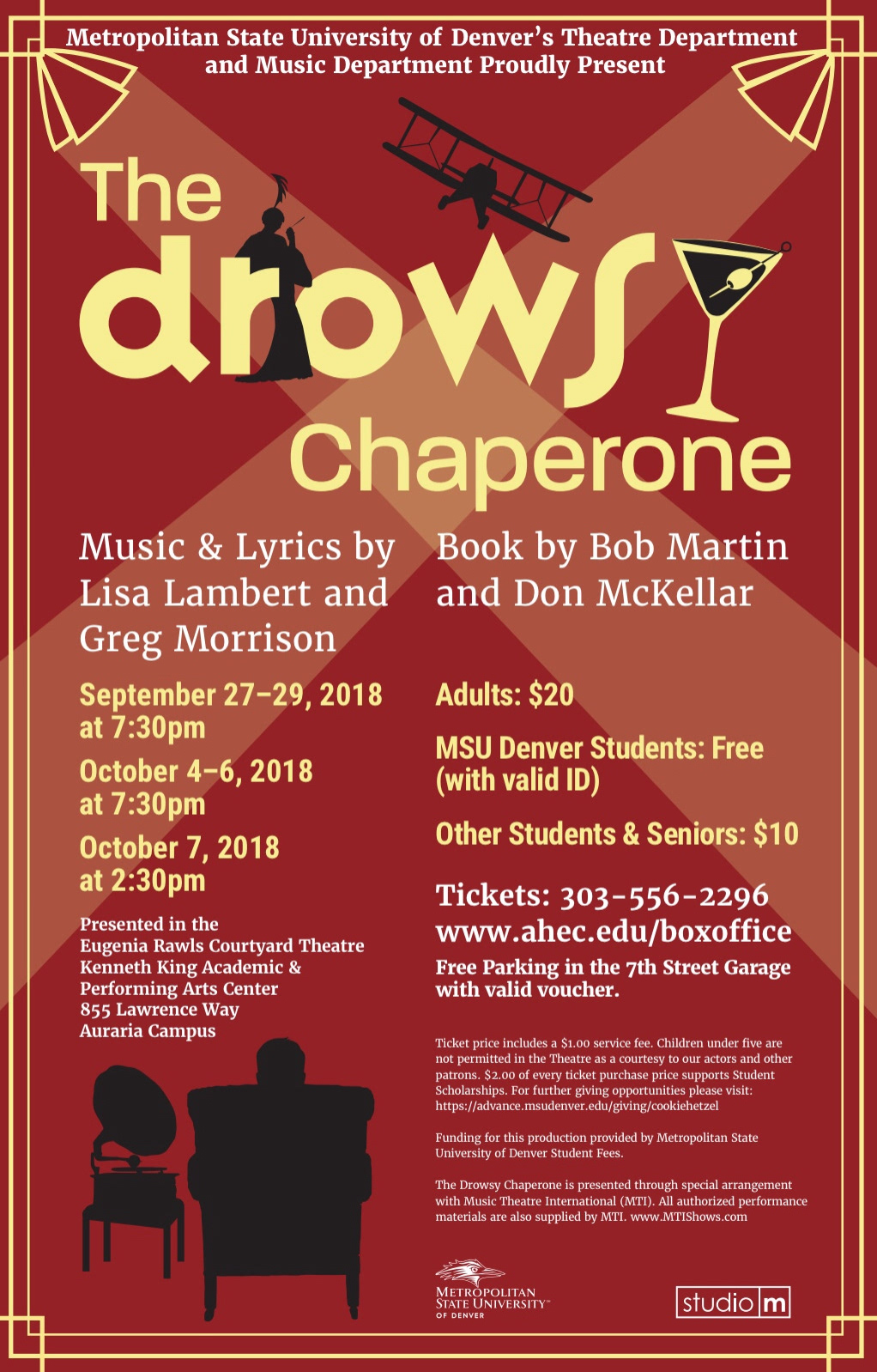
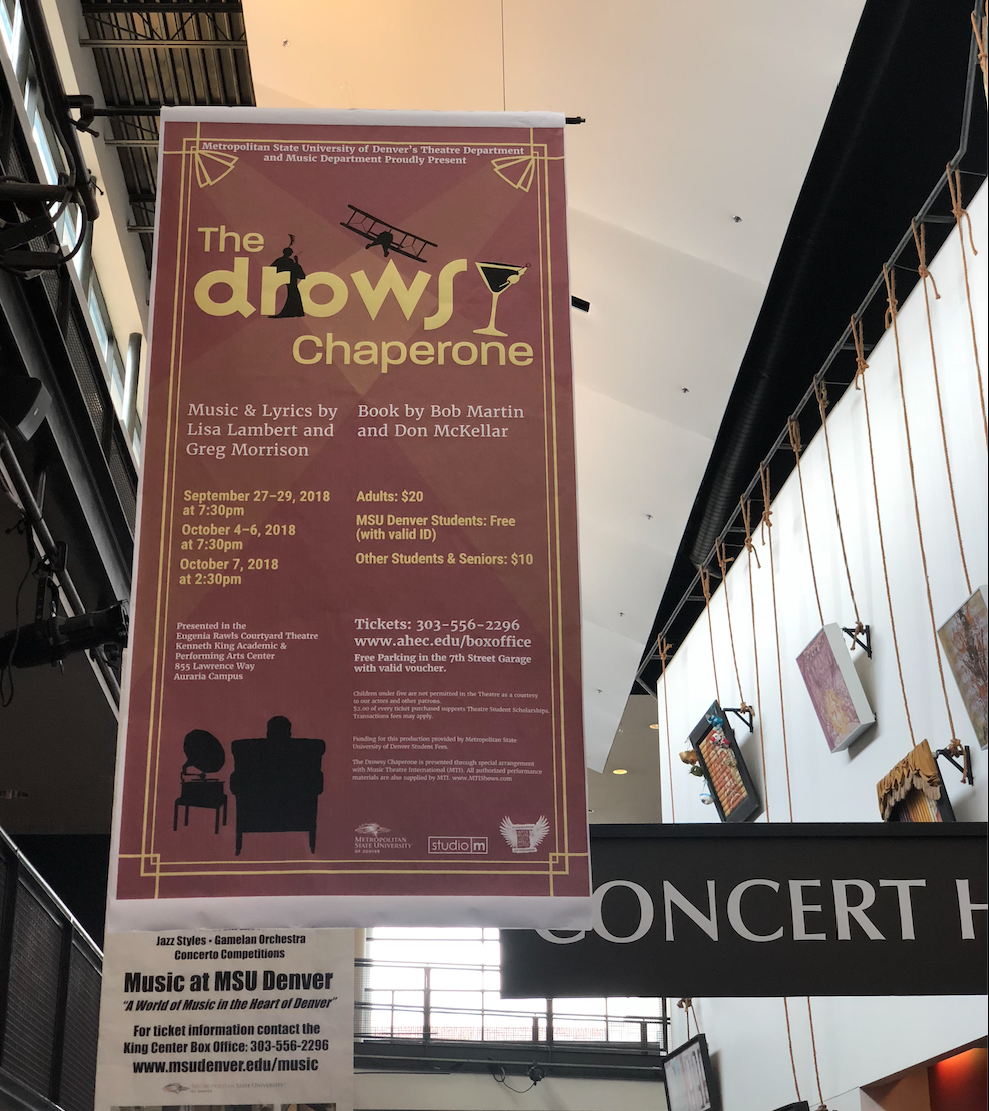
Creating poster designs for my internship at Studio M was beneficial in my growth as a designer. Not only did I get to interact with clientele, but also really understand what the clients wanted. For The Drowsy Chaperone The client wanted a narrative created in the poster that gave hints as to what the play was about. The man in the chair is the narrator of the story and the era is placed in the 1920's. I pulled elements from the era and the play to create the poster displayed below.
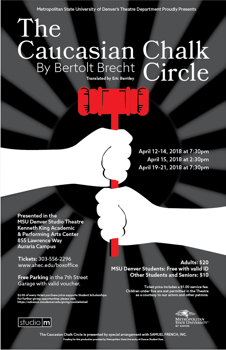
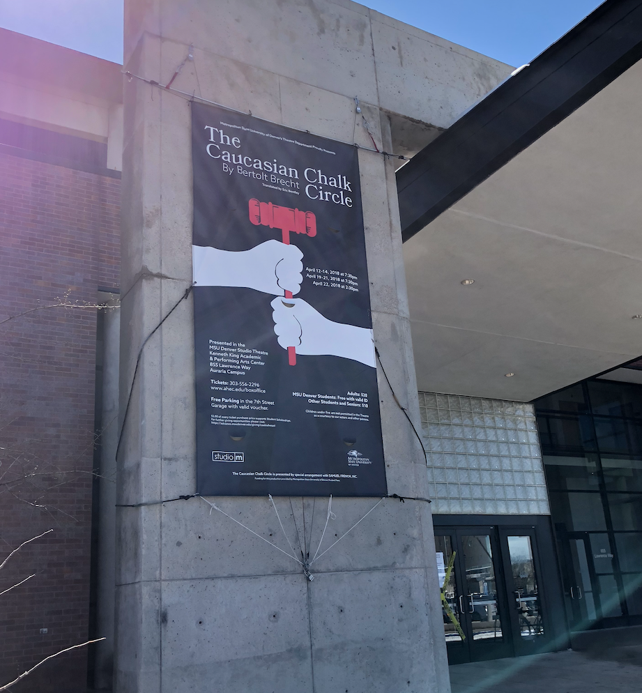
For the Caucasian Chalk Circle poster design the client requested a depiction of the struggle for power and justice. I utilize political colors and show two hands struggling over power which is what the play is about. The type choice was a serif font as this type lends to a more classical look that fits the play.